UX/UI Design | Web App Design | Gamification | Interaction Design | Figma | Concept Proposal | Remote
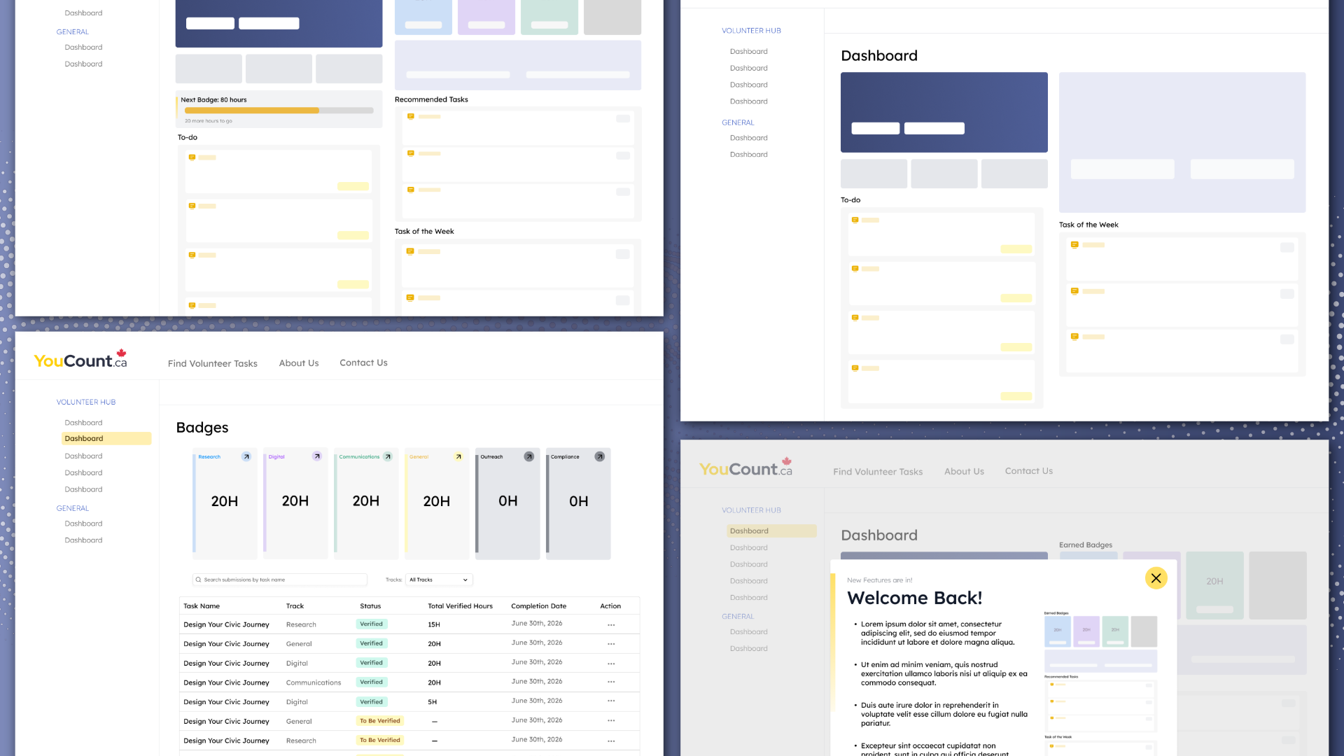
A non-official design proposal for a badge-based recognition system on GLOCAL's YouCount.ca volunteer platform — concept stage only; never developed or launched.
Overview
YouCount.ca connects volunteers with tasks across six tracks: research, communications, general/data, digital, outreach, and compliance. Volunteers can log hours, but nothing marks their progress or celebrates what they've contributed. This proposal designs a Volunteer Badge & Recognition System that automatically awards badges at hour milestones from 20 to 120, shows progress toward the next one, and lets volunteers share their achievements in a professional way.
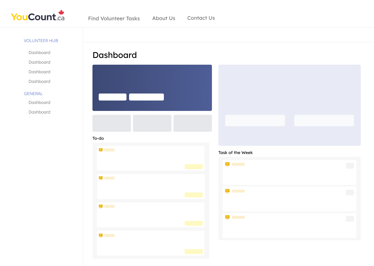
Before
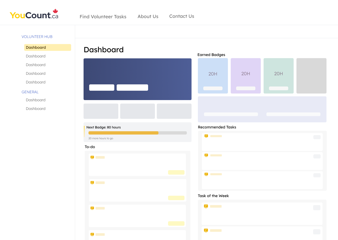
After
Research & Insights
I explored the platform to understand how volunteers discover tasks, log hours, and get verified. There are three types of users: volunteers who find tasks and track hours, coordinators who verify them, and admins who oversee partnerships and funding. The existing dashboard already did a lot, so the key insight was that the badge system needed to fit into it naturally instead of adding to it. I also noticed that returning volunteers had no personalized way to find their next task, and that any new feature would be missed by existing users who wouldn't stumble upon it.
Ideation & Design
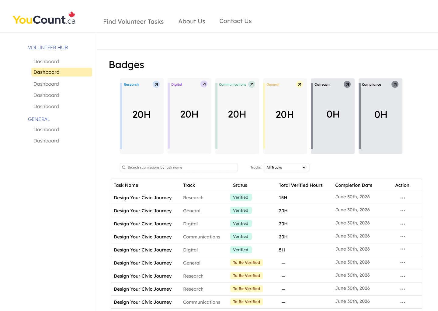
The proposed flow runs from Dashboard to Badges page to Badge detail to Share. On the dashboard, a new badge module sits near the top, colour-coded by track using GLOCAL's existing brand colours, with a "Next Badge" progress bar showing how many hours are left. A Recommended Tasks section suggests tasks based on tracks a volunteer has already completed, working alongside the existing Task of the Week. Locked badges stay gray against the colourful dashboard, so upcoming milestones feel worth chasing. I used Claude during planning to structure user flows, develop wireframe concepts, and test hierarchy decisions before moving into mockups in Figma.
Proposed Solution
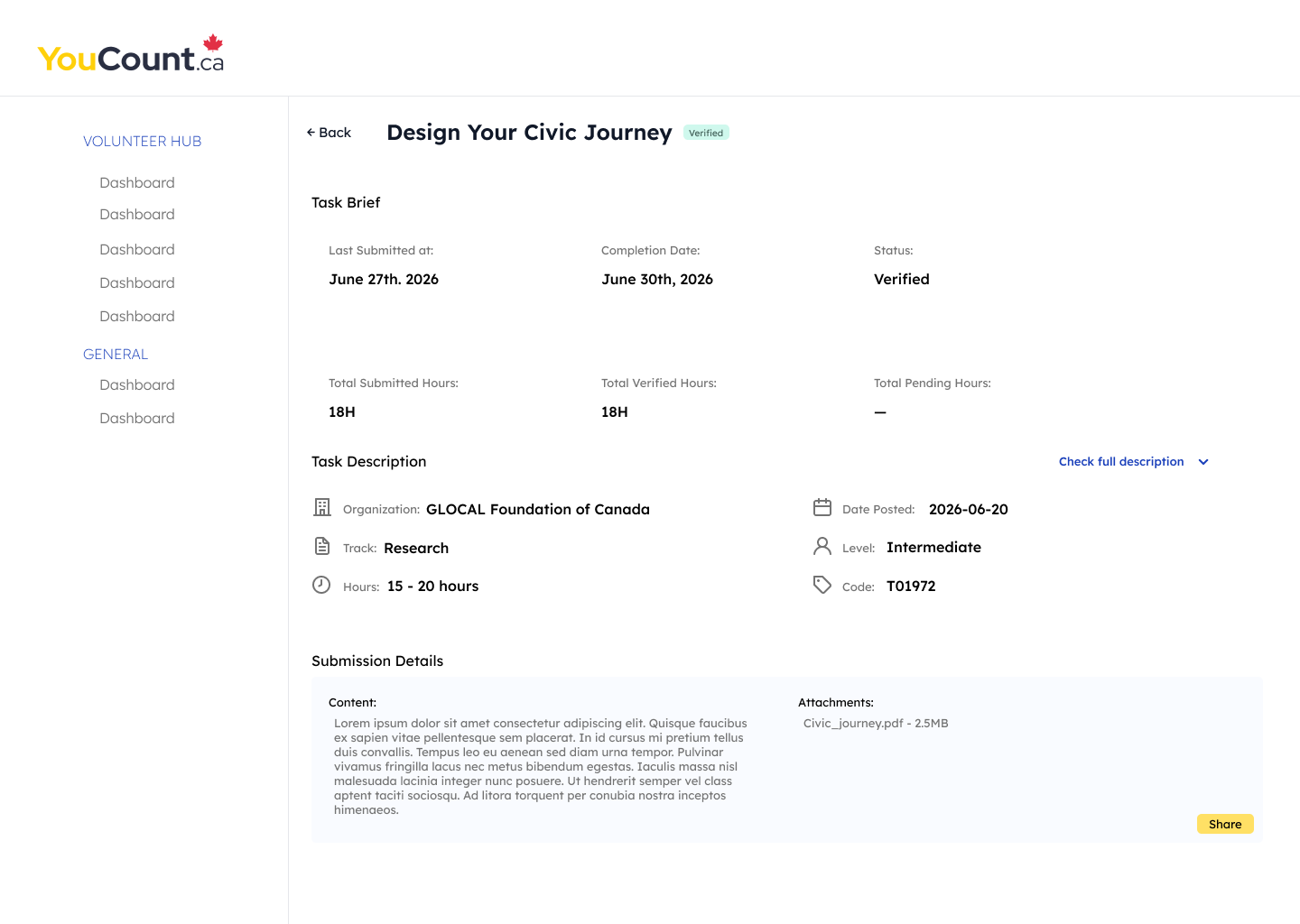
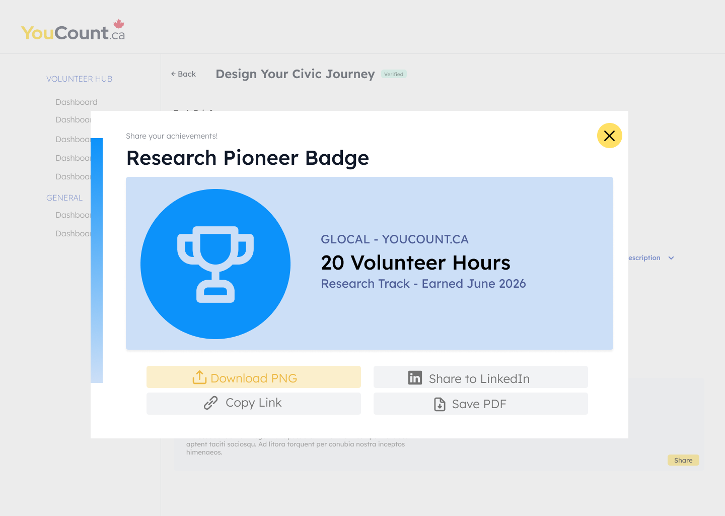
The proposal has four key parts. The dashboard surfaces badge progress and recommendations. The Badges page shows the full collection by track, with earned and locked states and a searchable list of submissions. The badge detail view breaks down the specific tasks completed toward each badge. The share view generates a branded card, which volunteers can download as a PNG, save as a PDF, copy as a link, or post to LinkedIn as an official record of their hours. A "Welcome Back" pop-up introduces the new features on a returning user's next login, so no one misses the update.
Reflection
This was an early-stage proposal, so I focused on the structure, flow, and rationale instead of polishing every detail. It showed me how much a feature's success depends on where it sits in an existing product. Fitting the badge system into the current dashboard mattered more than adding new screens, and designing the pop-up taught me to treat rollout as part of the design, not an afterthought. The next step would be testing the share card with real volunteers to see which format they'd actually post, and designing how coordinators see badge milestones when verifying hours.