Brand Identity | Brand Strategy | Logo Design | Product Design | Concept Development | Adobe Creative Suite | Adobe Firefly | Independent Project | Waterloo
A non-official rebrand that explores the brand's story and aims to improve and establish a more concrete identity.
Overview
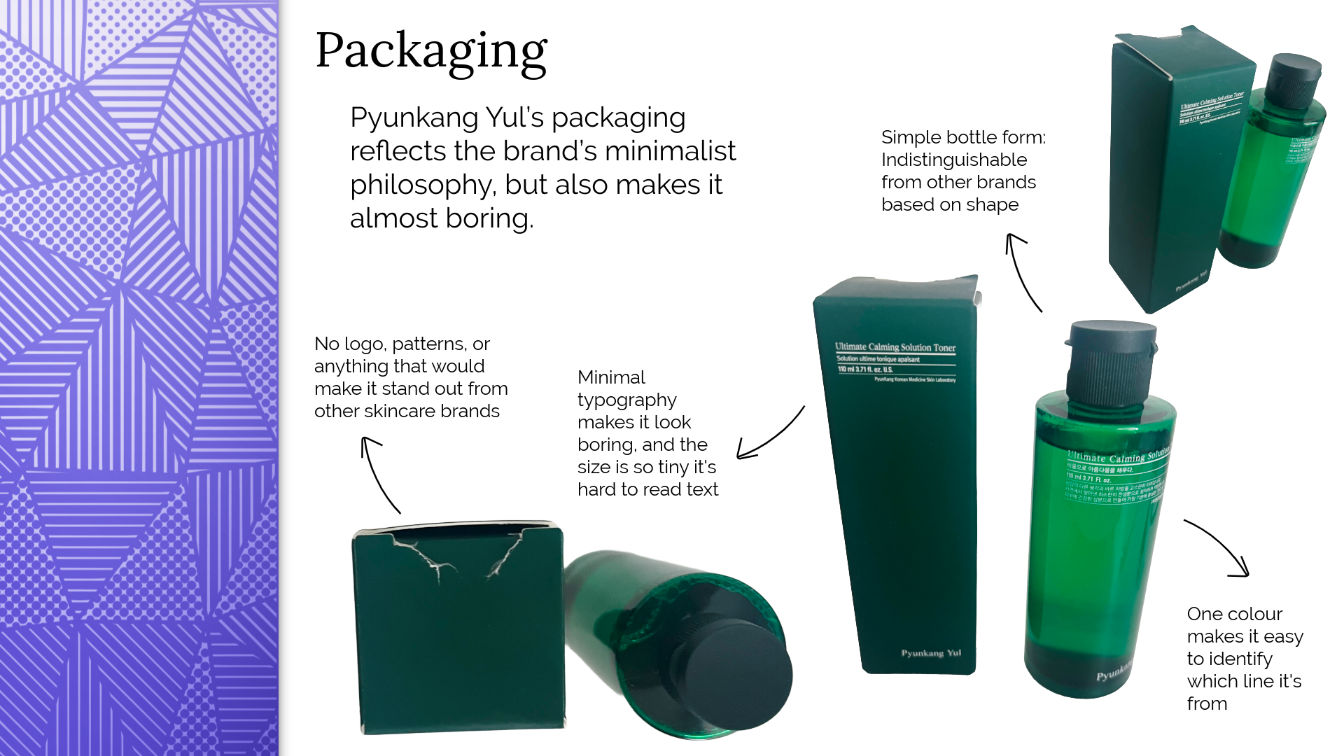
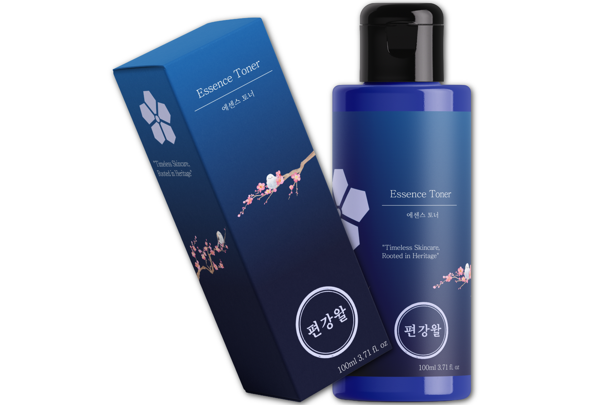
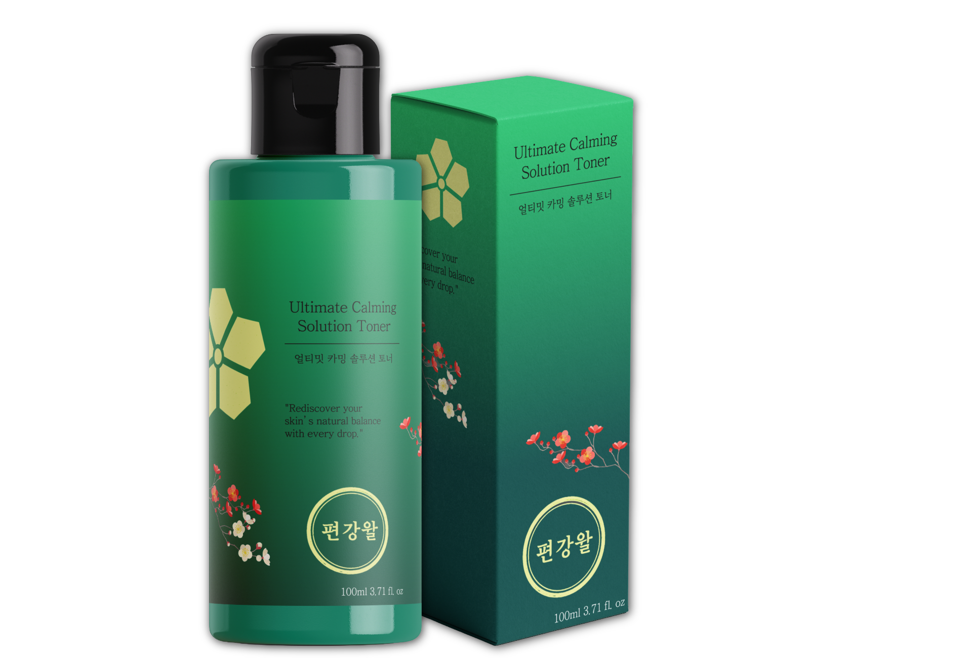
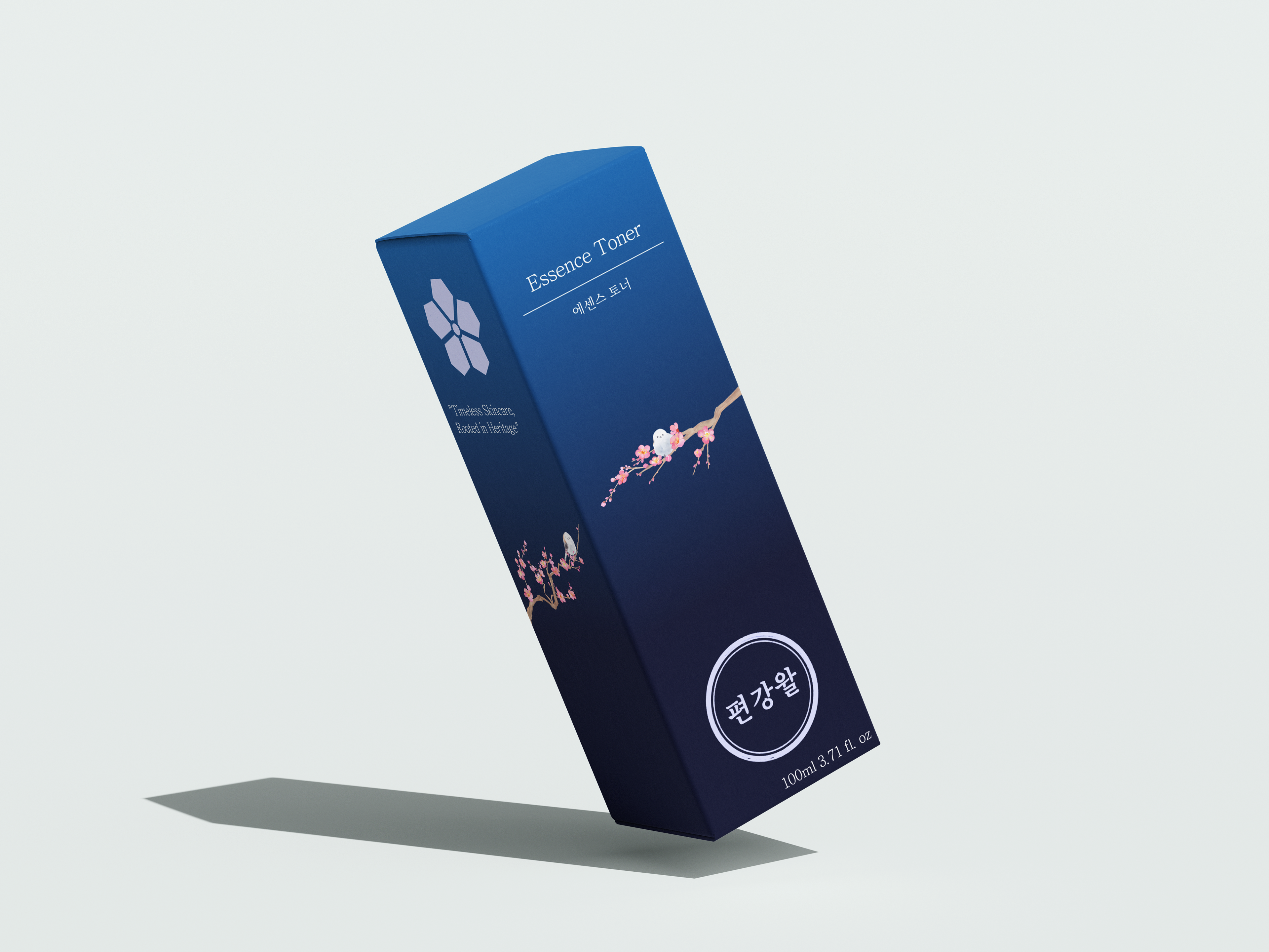
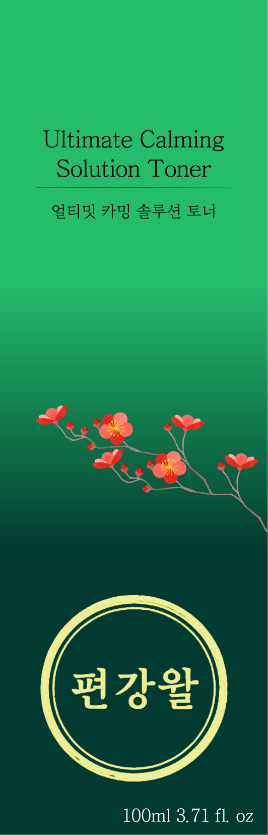
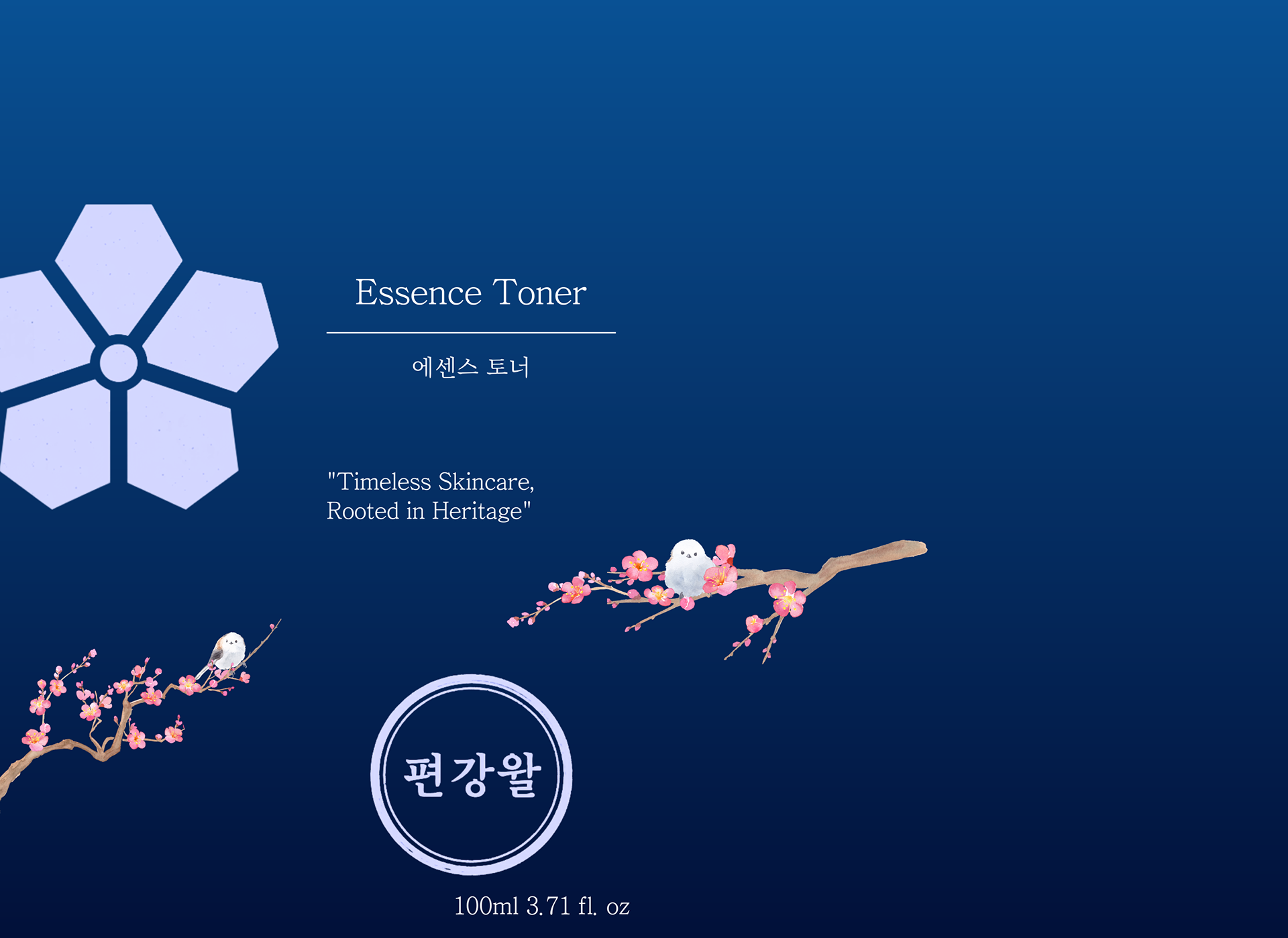
Pyunkang Yul is a Korean skincare brand rooted in over 50 years of Eastern medicine practice. While its clinical credibility and minimalist approach were genuine strengths, the existing branding lacked visual identity, no logo, no heritage storytelling, and packaging that blended into the shelf. This project was a full brand identity redesign completed as an independent academic project, guided by a single creative direction: Heritage in a Bottle.
Research & Insights
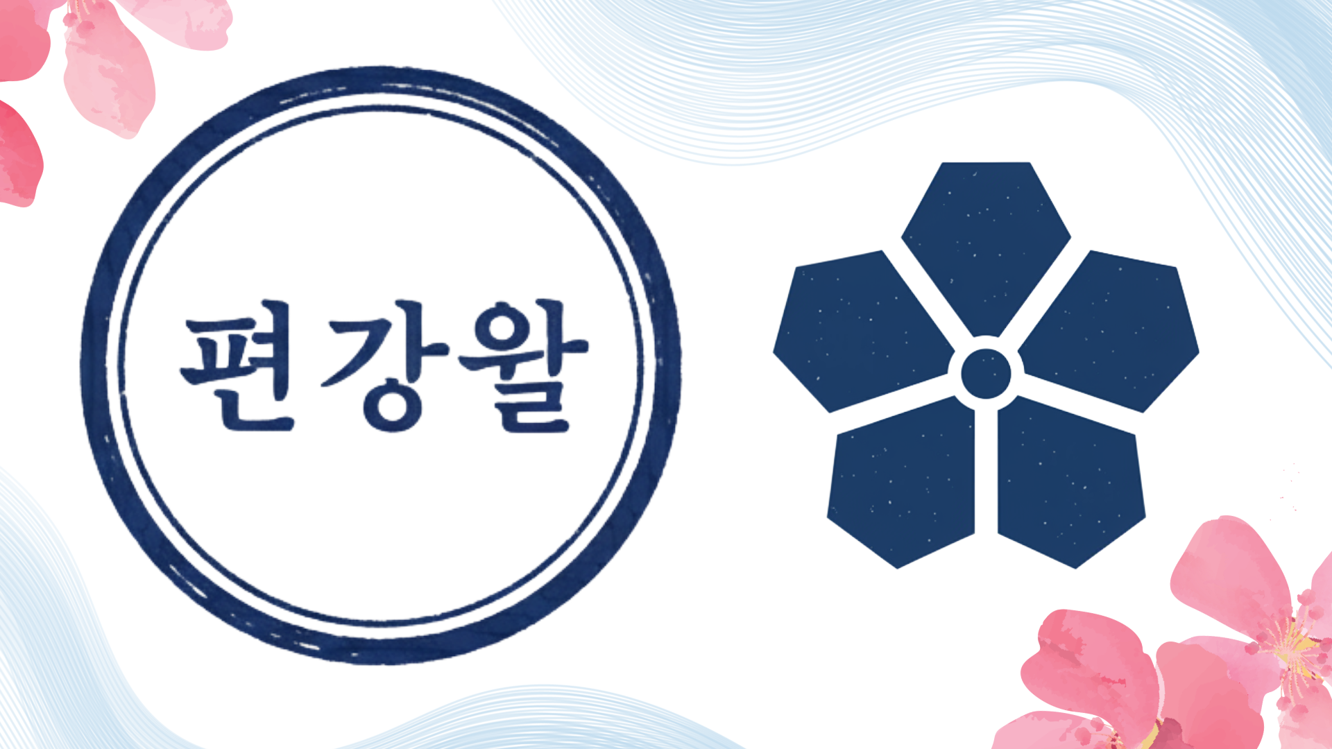
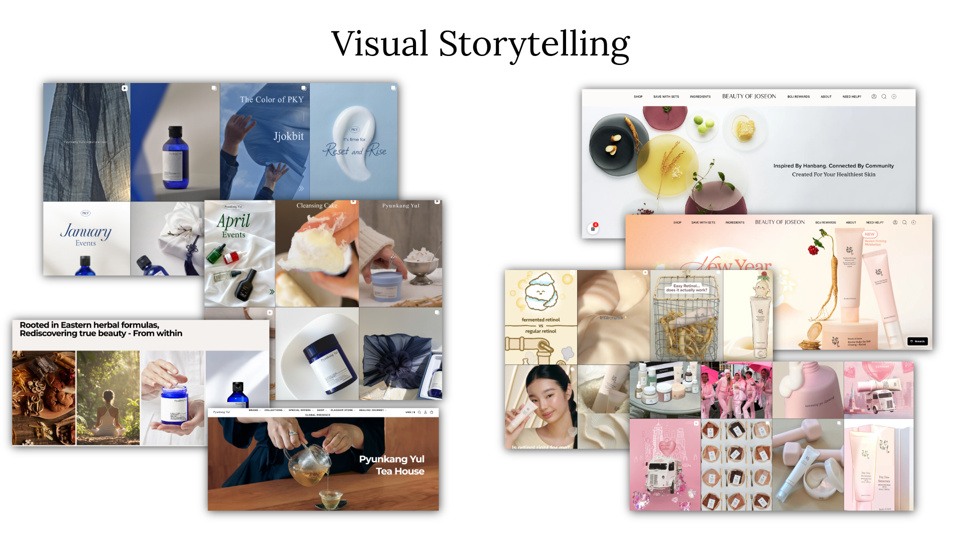
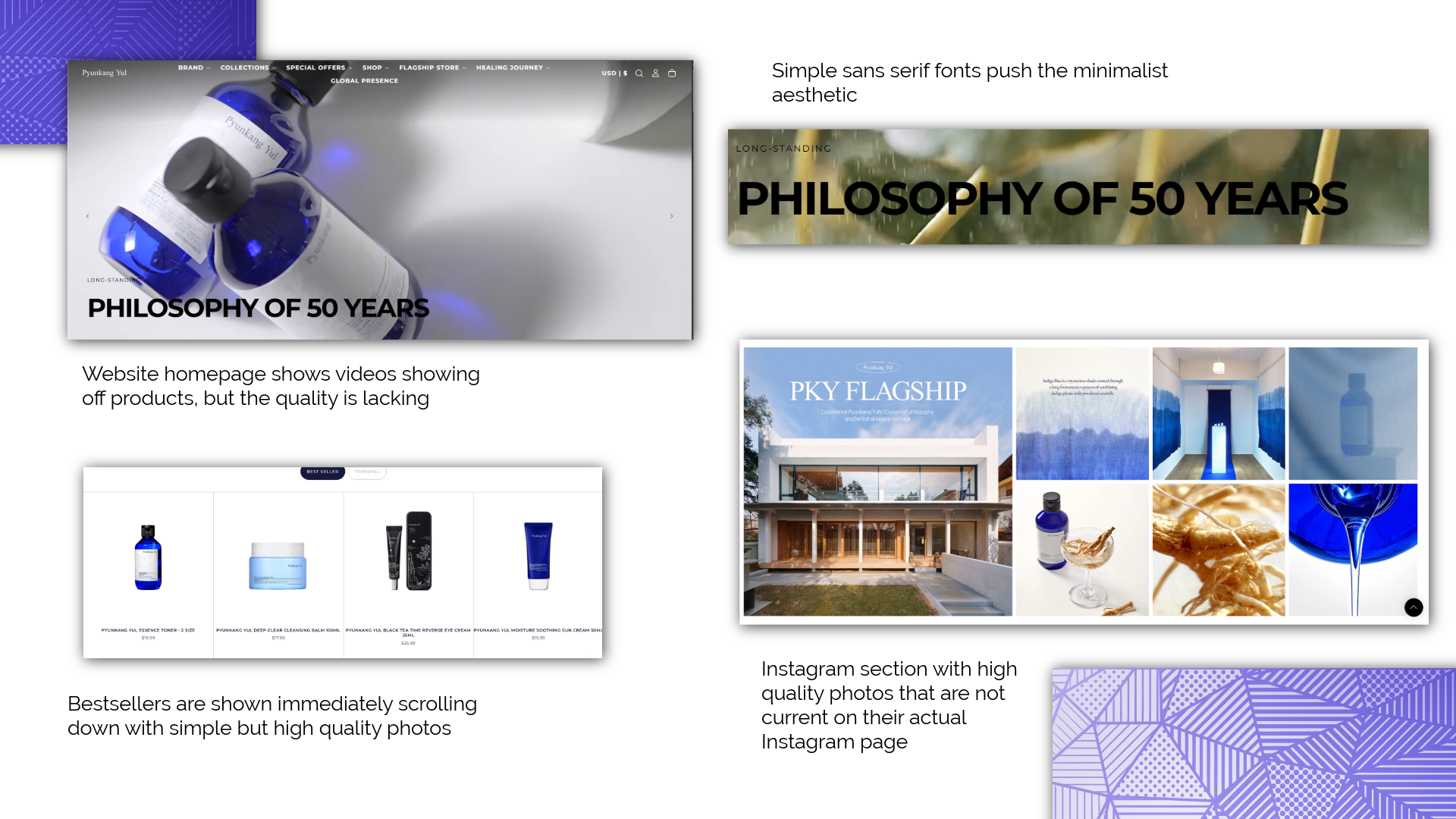
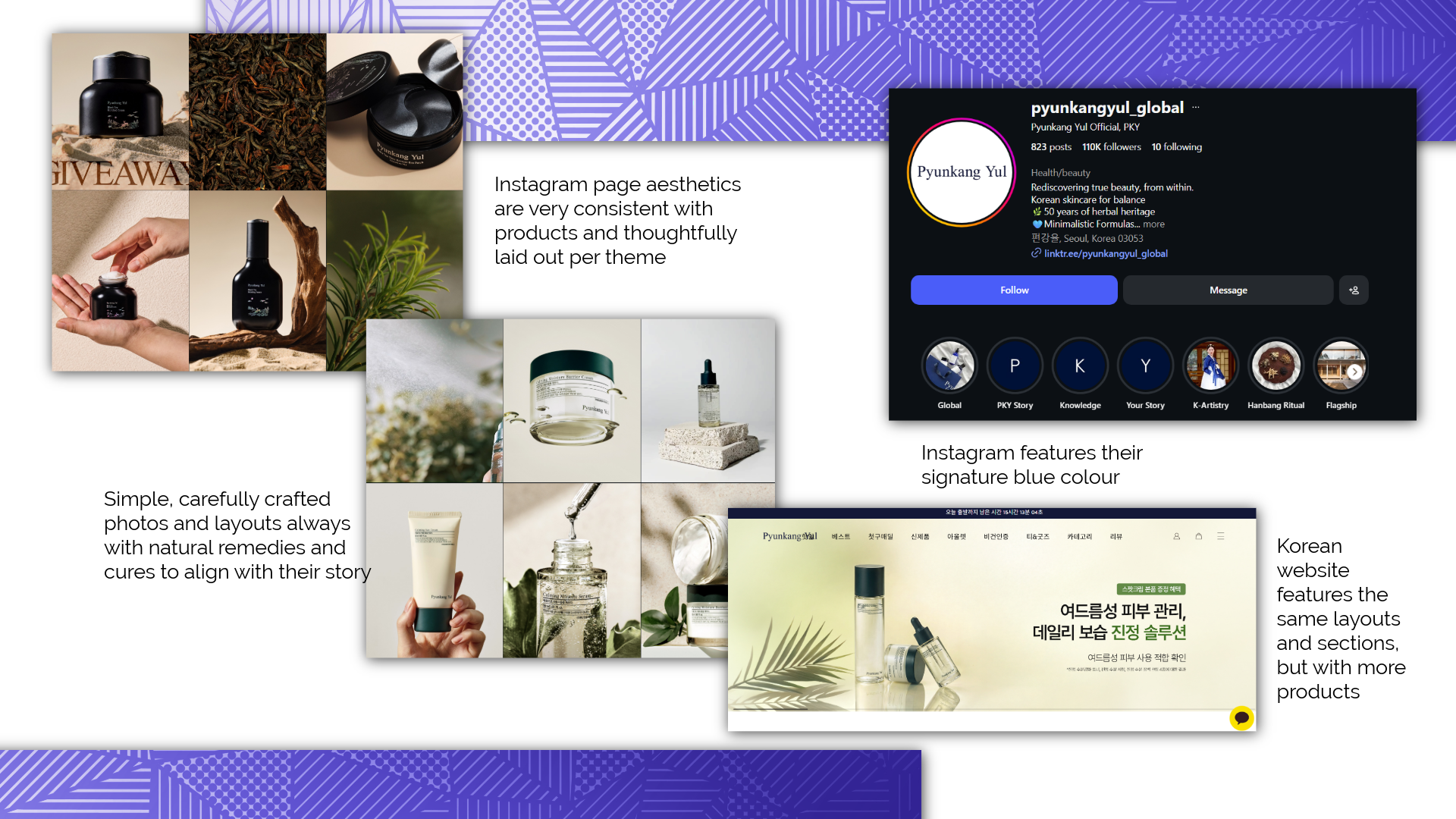
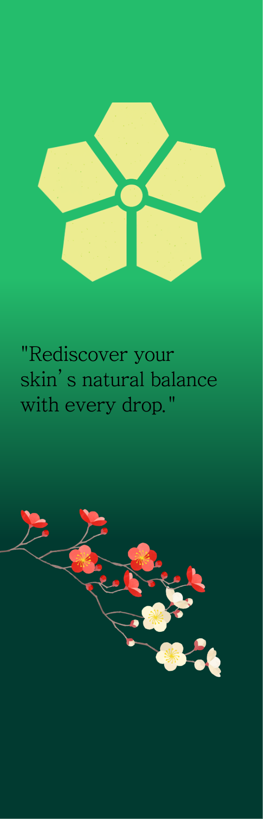
I studied Pyunkang Yul's existing social presence, packaging, and how it compared to competitors in the K-beauty market. The brand already had a strong base, consistent blue tones, clinical aesthetics, and a loyal audience that valued long-term skin health over trends. What it lacked was symbolism. I researched traditional Korean visual language, particularly the dojang seal format and the plum blossom as a cultural symbol of resilience and renewal, which became the two anchors of the redesign.

Ideation & Design
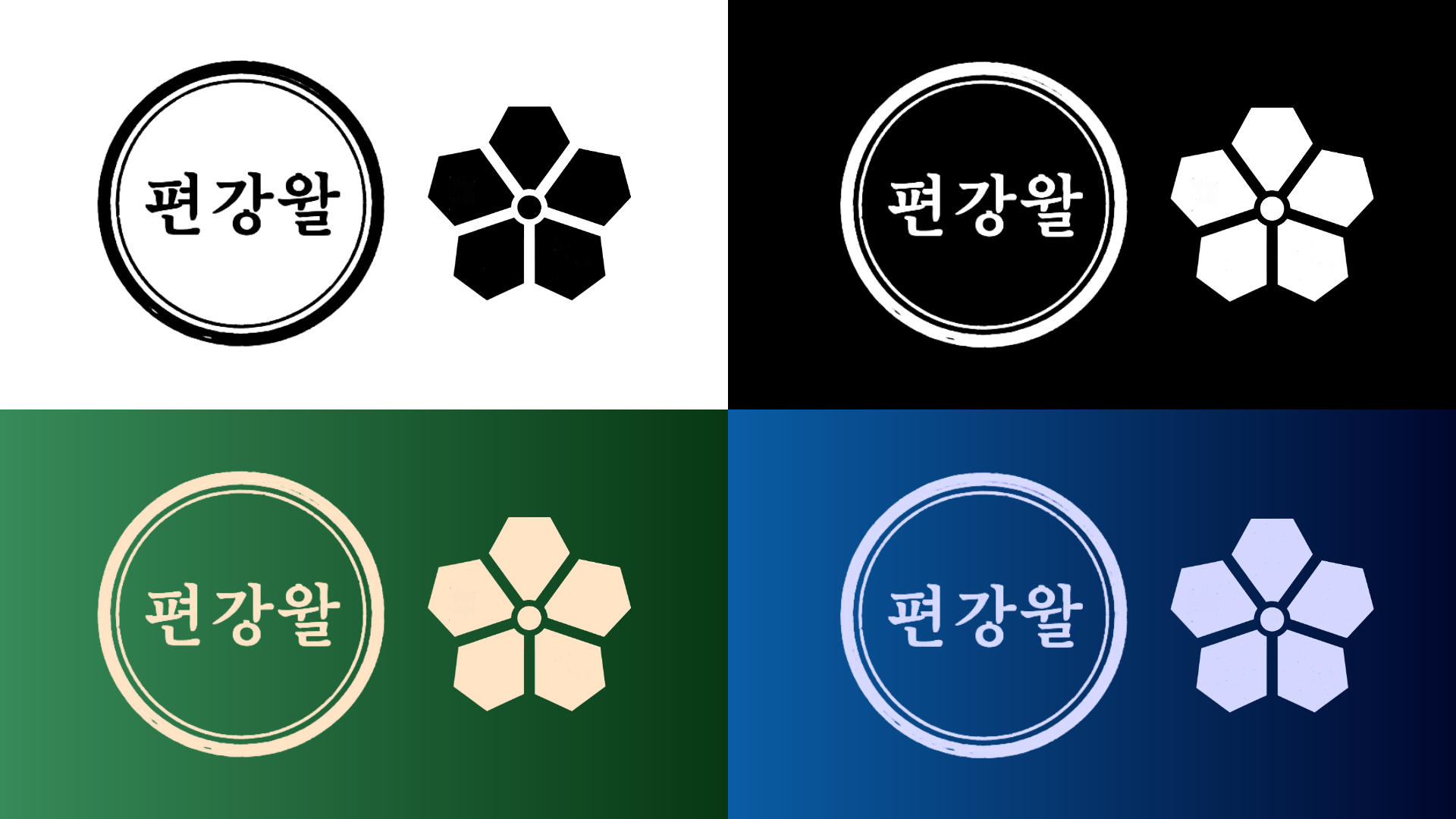
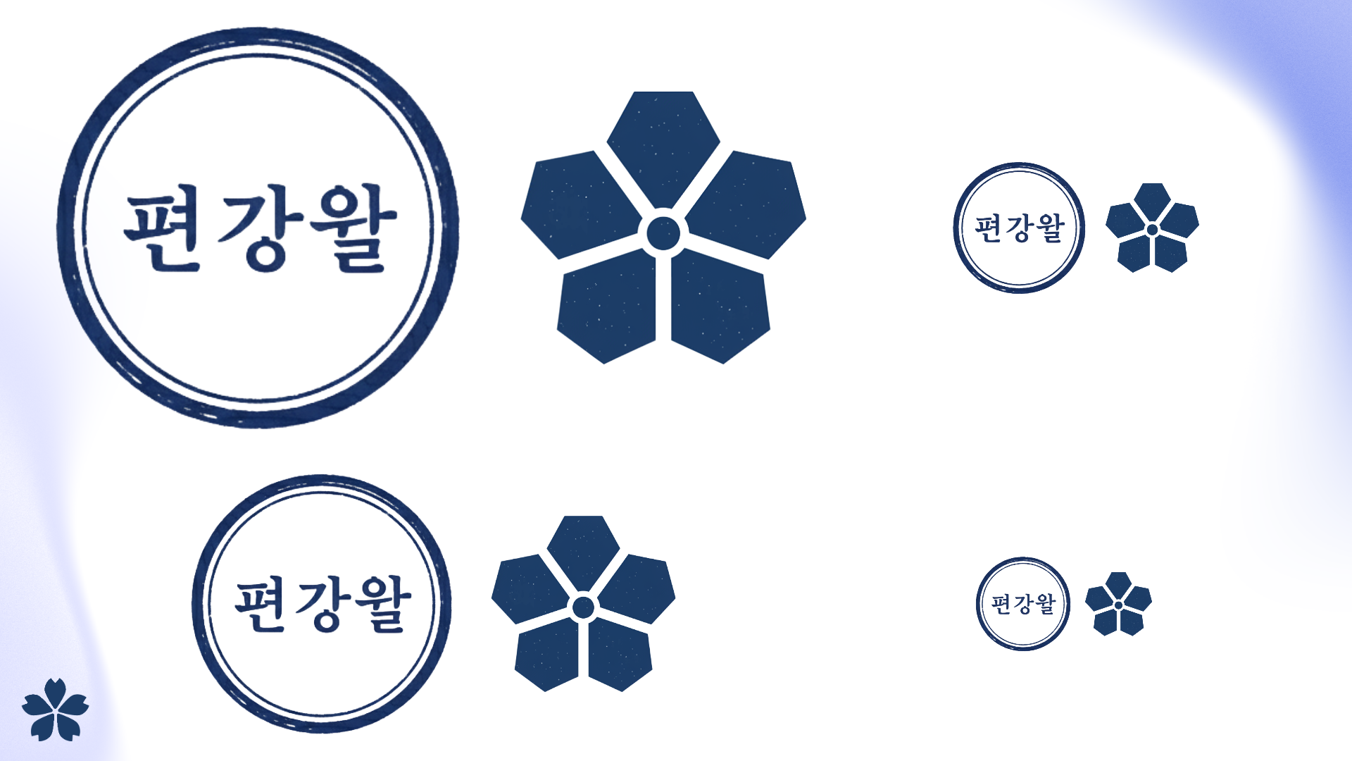
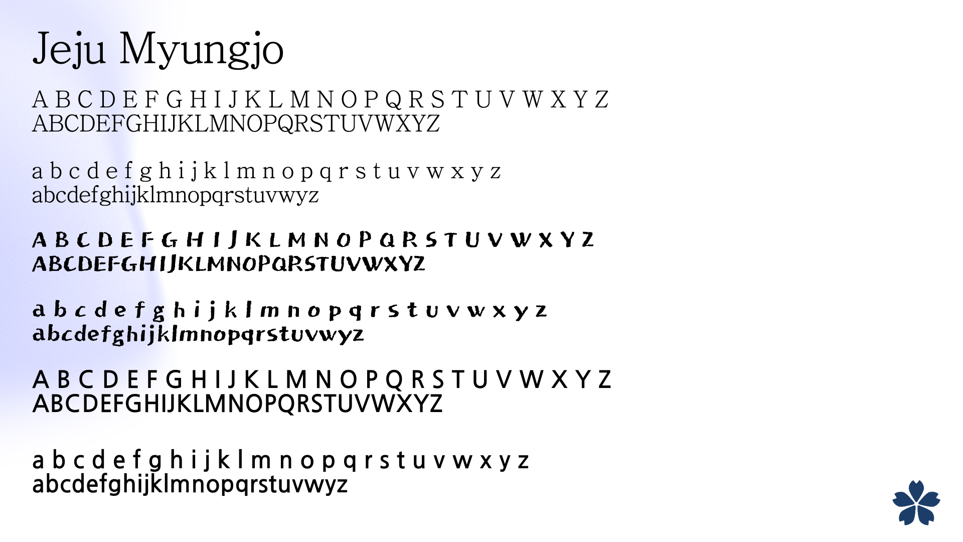
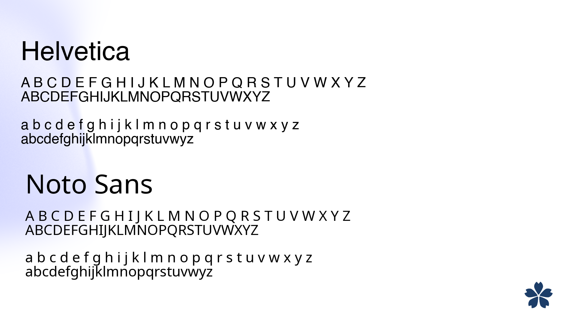
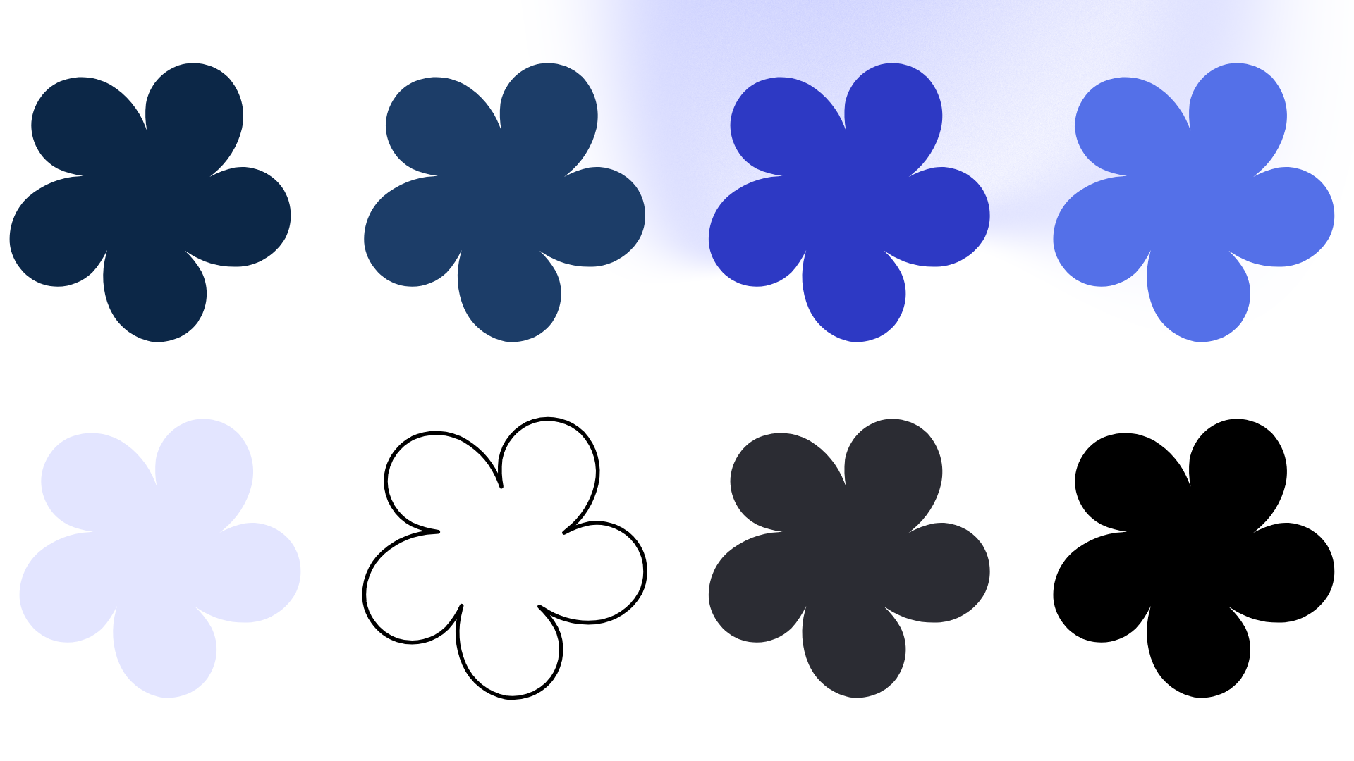
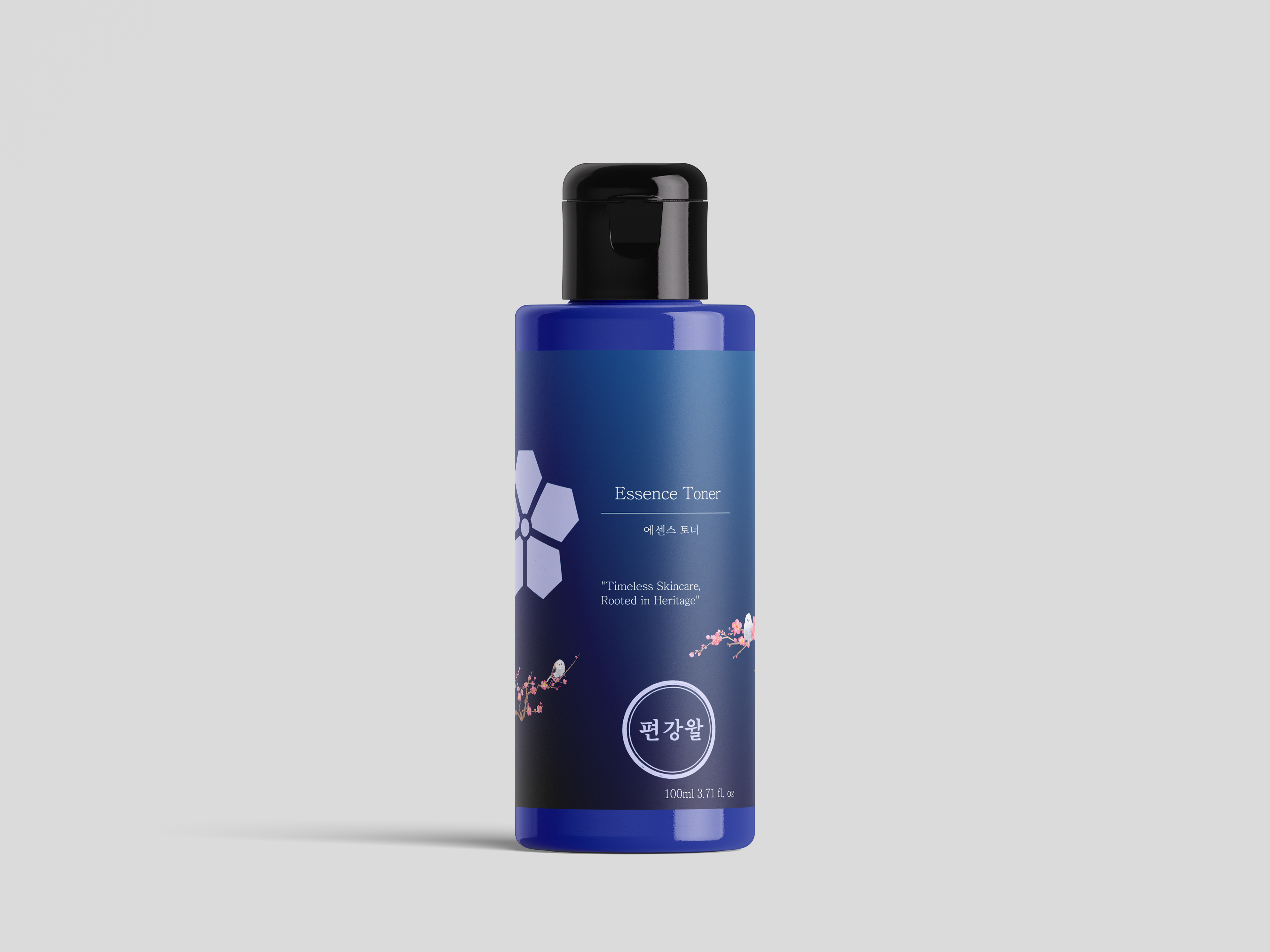
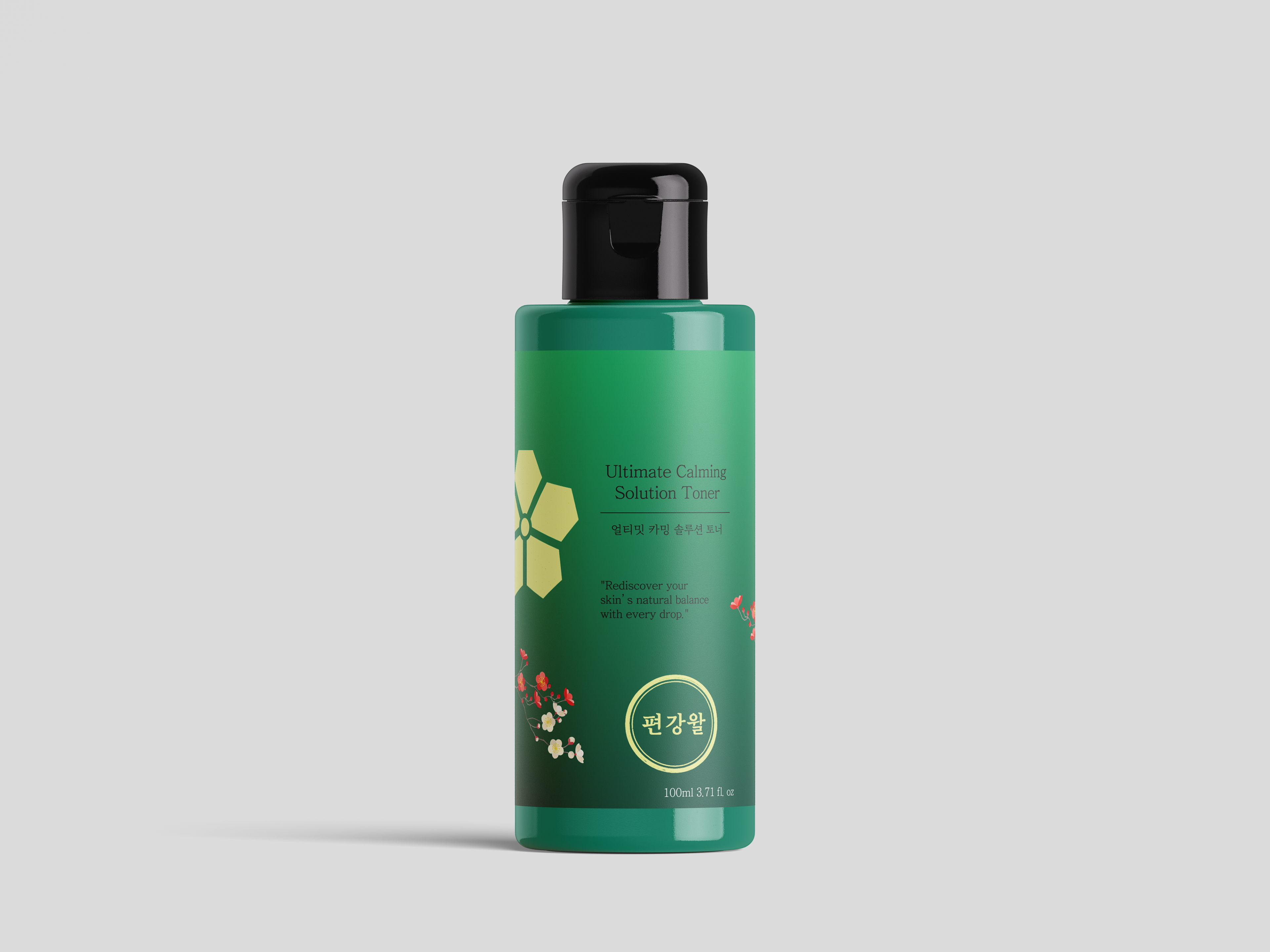
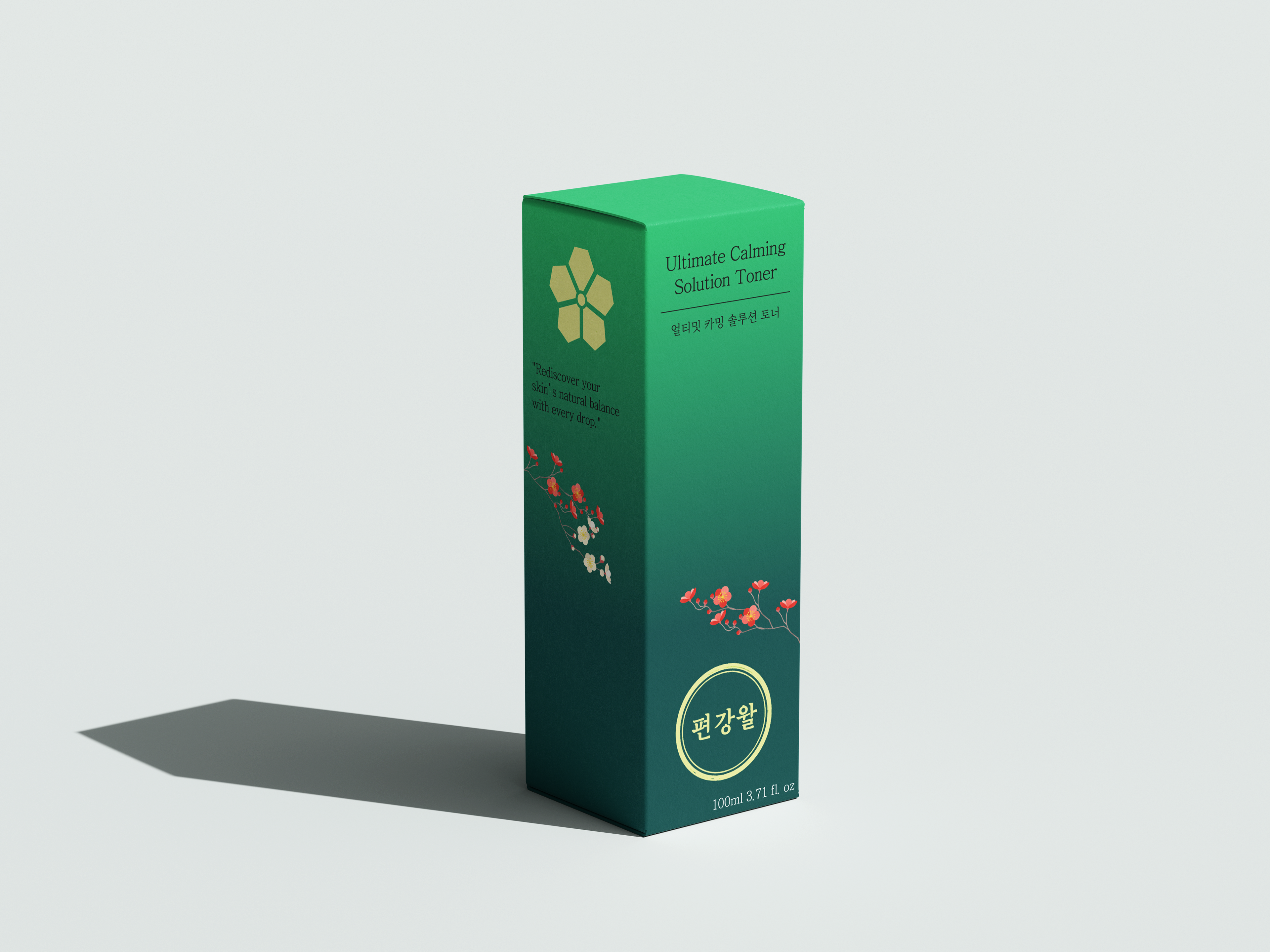
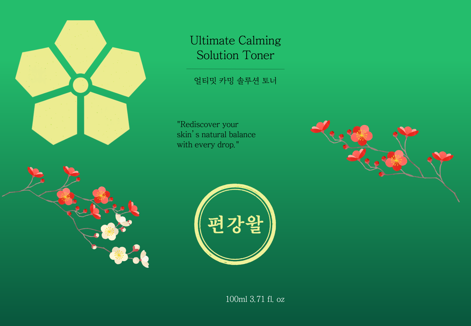
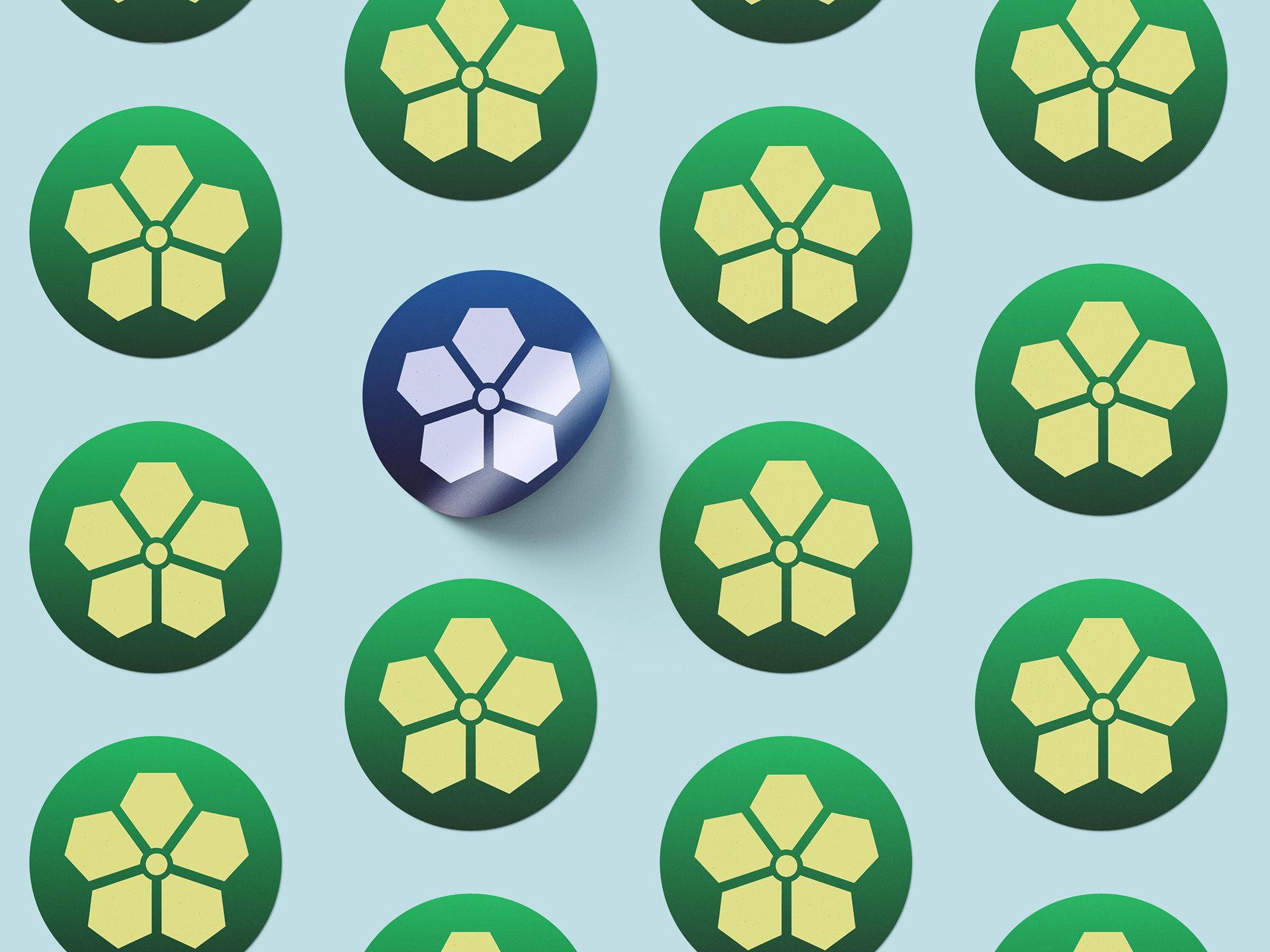
The logo system centers on a circular seal in the traditional Korean dojang style, with the brand name written in Hangul, grounding the identity in heritage while clean geometry keeps it modern. The plum blossom serves as a secondary mark, adding emotional warmth without overcrowding the primary logo. Typography pairs Jeju Myungjo with Helvetica and Noto Sans to balance heritage with global legibility. The signature deep navy anchors trust and clinical credibility across all applications.


Final Product
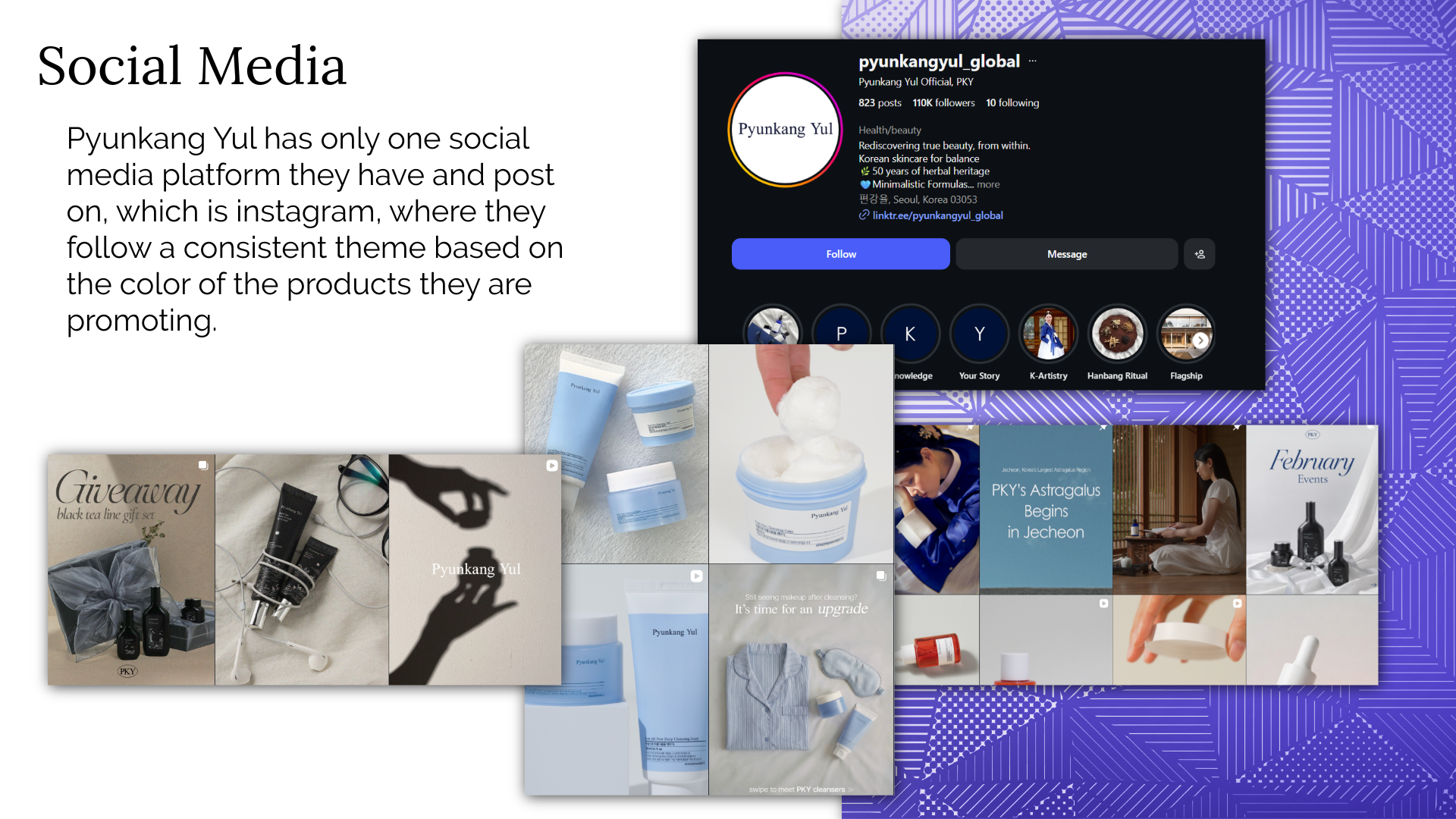
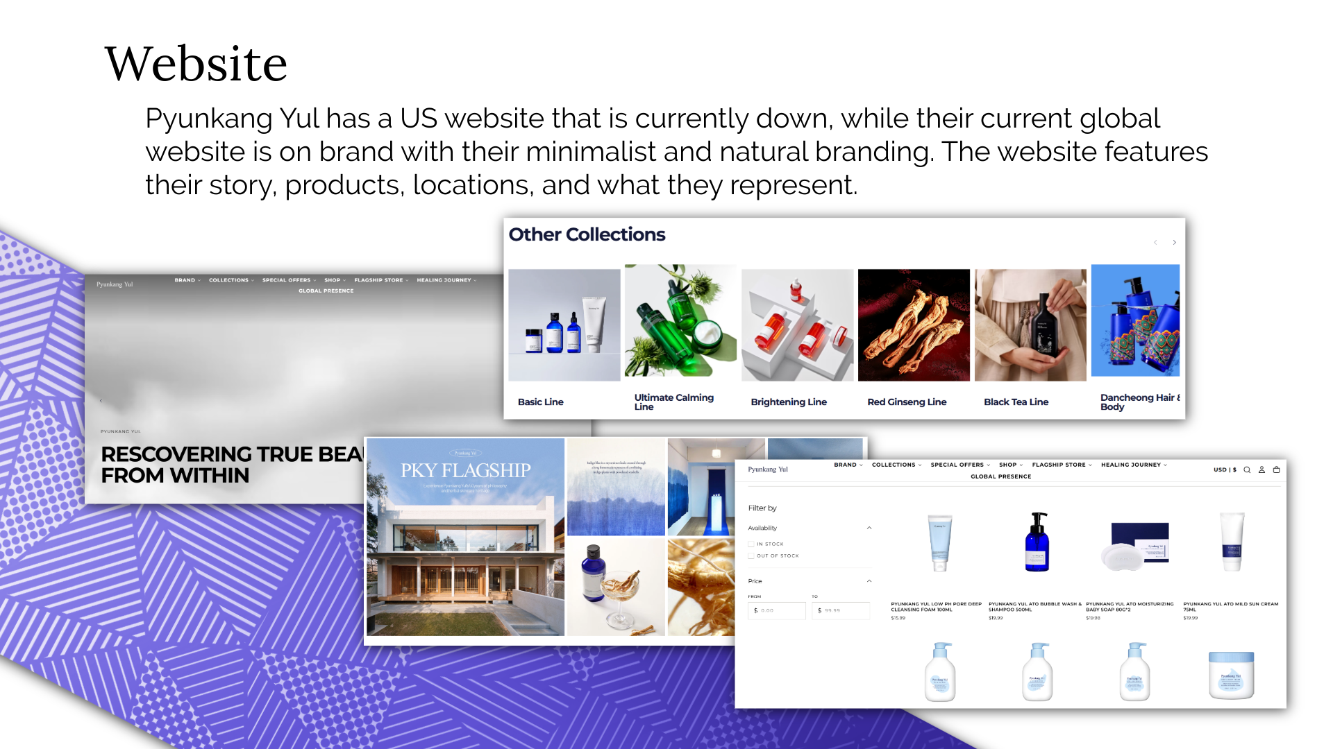
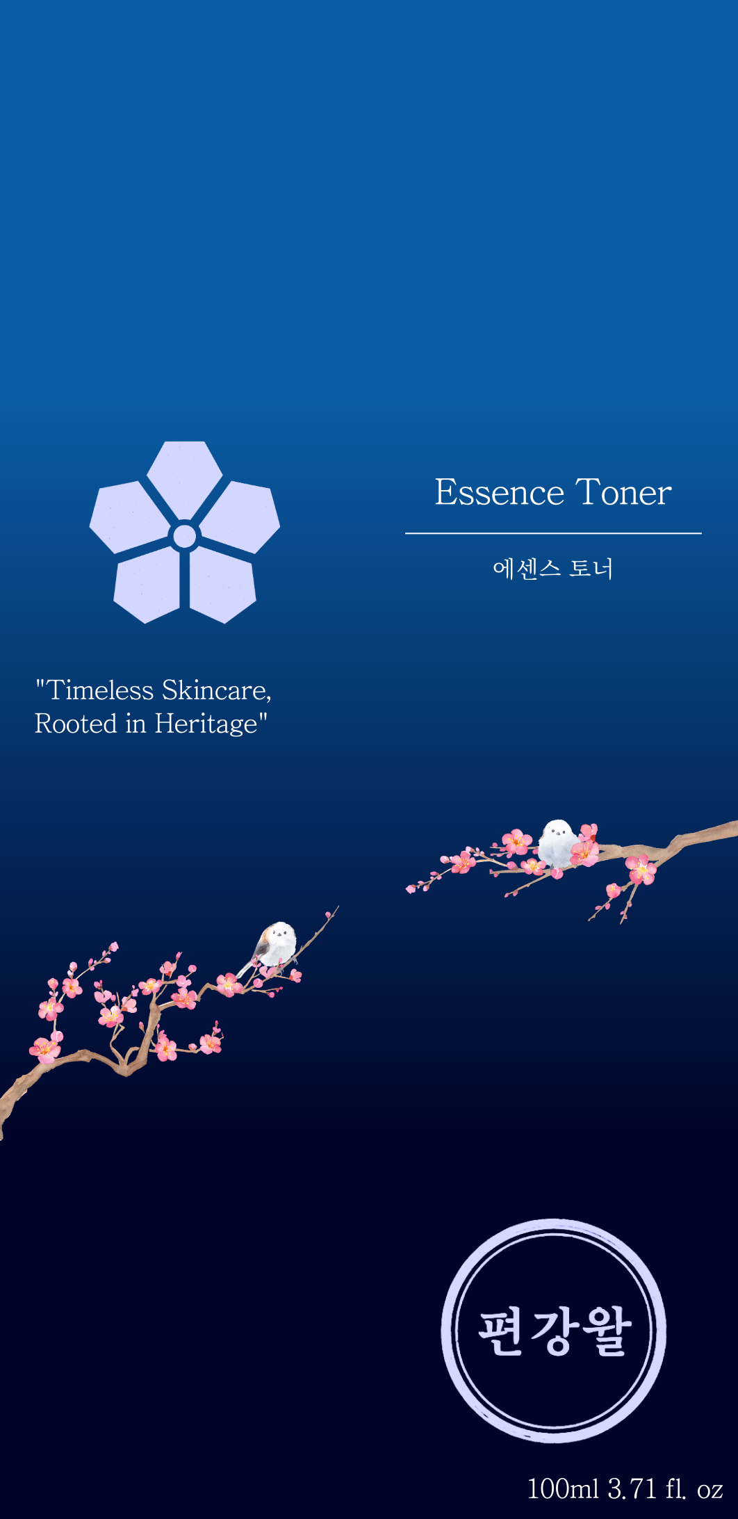
The rebrand spans a full identity system: primary and secondary logos, colour variations across backgrounds, packaging mockups for two hero products, social media templates, and four short marketing videos. The packaging applies the new identity across both the green and navy product lines, weaving the plum blossom illustration and Hangul seal consistently across the box and bottle. All assets were produced and edited in Adobe Express, Adobe Firefly, and Photoshop.
Reflection
This project taught me how much a brand can say through restraint. The challenge wasn't adding more; it was about adding the right thing. Deciding to use the dojang seal format was the turning point; once that was locked in, everything else fell into place around it. If I were to continue the project, I'd develop a more complete social media template system and explore how the identity could translate into physical retail environments.